Ucha.se
Redesigning the biggest Bulgarian e-learning platform
The client
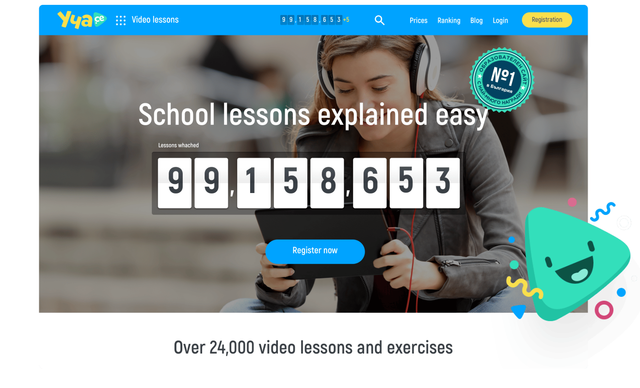
Ucha.se is the biggest education platform in Bulgaria, with over 1 million users and numerous schools across the country. The platform includes short video lessons for K-12 learners that explain the school material in a fun, simple and easy-to-understand language. After each lesson, students can check their knowledge with a test and revise what they learned through mind maps. Users can use the first 5 video lessons, tests and mind maps for free, and purchase a subscription to gain access to all 25 000+ educational materials on the platform.

The challenge: Decreasing the ‘churn’ rate
While students and teachers alike found the video lessons very valuable and engaging, Ucha se noticed that many users were not active enough on the platform – they logged in rarely, watched few videos and solved few or no tests. Ucha.se also noticed a tendency among these less active users – they were less likely to renew their subscription after it expired. This rate of ‘lost users’, also called churn rate, meant Ucha se had a good amount of active users but had a hard time growing the user base year on year.
The Ucha.se team wanted to tackle this issue by giving its website a fresh, modern and teen-friendly look, while also making it more user-friendly and intuitive. They also wanted to create a mobile app that could make the whole experience much smoother and available on every device. The app could help them strengthen the connection with students and motivate them to engage with the platform more often, as they would receive news, new lessons, and reminders directly on their phone. Despark’s mission was to support the already awesome video lessons in the platform with an equally strong user experience and user interface both in the web and mobile versions. To that end, we:
- Conducted interviews with core users of the platform
- Collected responses from over 50 active Ucha.se users in online surveys
- Crafted a whole new brand identity of the platform
- Created a new UX/UI design of the web and mobile app to ensure a smooth and user-friendly experience
We focused on three main goals:

Redesign the platform so it looks modern, consistent and appealing for all users

Make all platform features easily accessible and user-friendlyd

Improve the functionality of the platform
Our Insights
We couldn’t jump in the project without first talking to some of the core users of the platform - students from the 5th to the 12th grade, as well as their teachers. We interviewed a total of 18 children from the 5th to the 12th grade in order to understand better their way of using the platform and their needs. We also met with primary and high-school teachers teaching different subjects to get insights into their user behaviours. Here’s what we found:
Younger children relied on the platform more often than older ones, and most enjoyed the way the lessons are delivered and the visual outlook of the platform. However, older students (16 years-old and above) used it primarily when they needed to catch up with lessons but they were annoyed by some of the videos having “childish” jokes and they generally perceived the design & outlook of the app to be too childlike.Younger children relied on the platform more often than older ones, and most enjoyed the way the lessons are delivered and the visual outlook of the platform. However, older students (16 years-old and above) used it primarily when they needed to catch up with lessons but they were annoyed by some of the videos having “childish” jokes and they generally perceived the design & outlook of the app to be too childlike.

George
 Grade 5-8th
The examples are really useful in the lessons - all the information in my textbook is too academic and boring for me to follow.
Motivation
Lessons are explained in an easy and engaging way. It is easier to watch videos than to read the textbook
Usage patterns
They usually use it at home on a laptop or PC, mostly daily.
Lessons
They enjoy the visual elements in the lessons, especially for subjects like Biology - it makes it easier to understand and memorise information
Platform design
They enjoy the current design and would even like it to be more colourful
Pain points
They struggle with matching the video lessons with the lessons in their textbooks and are confused if they are watching the correct video lesson for their class.

Gergana
Grade 9-12thIn some video lessons the jokes are out of place and sound awkward.”
Motivation
It is an easy way to catch up a missed lesson from school.
Usage patterns
They use it mostly at home on a laptop or PC, not very often. Would like to use it on a mobile device on the way to school.
Lessons
They find the content of the lessons very valuable but they are sometimes annoyed by the jokes, as they seem childish
Platform design
They consider it too child-like
Pain points
They perceive some videos to be too immature, which annoys them
We’ve also found that all the children we talked to were very loyal to Ucha.se and treated it almost like a vlog - preferring one presenter more than another, following the new content, and waiting for more. Even though some considered its touch and feel quite childish, they still used it because they find it crucial for their study process.
The design wasn’t consistent
Some functionalities were built on top of old implementations and the design wasn’t consistent across the system. This made some features difficult to find and understand, which means users were not able to use the platform to its full potential.
There were confusing user flows
Sometimes users would say one thing and behave differently online. That’s why after the interviews, we observed how the users interact with the platform and where they meet difficulties. We’ve also did our own research to inspect other areas of improvement in the UX/UI. Some of the issues we identified include:
When doing the test after the lesson, the question changed its position on the screen
There were many different colours used throughout the lessons, which affected usability
When learners needed to complete some exercises, they were asked to ‘connect the terms’ but the activity they need to complete is ‘drag and drop’
When a user received a notification on the device from another app and opened it, there was no way to continue where he left off and had to start all over again
There was no option to retake a test
The Solution:
A new look & feel and improved user flows
Despark uncovered all the insights during the Discovery phase and dived into creating a whole new Brand identity for Ucha.se with an updated design and custom illustrations.
The new brand identity
The new logo of Ucha.se was made with the main target group in mind - the students. We chose Sunny Yellow, Playful Green and Main Blue for the main brand colours because of their vibrance - they are fresh and modern and set a positive mood. We also bet on a fun writing of the inscription “Ucha.se”, combined with a soft architecture of the ‘play’ sign which directly related to the main feature of the platform - recored video lessons.
While we chose high contrasting and vibrant colours and a modern logo design that will appeal to older students, we created a playful and memorable mascot to give life to the logo and make it attractive for the younger audience. Ucha.se can also use the mascot to enrich the brand in various communication materials - be it in illustrations, print, video, animations or in any seasonal campaigns.
The new logo of Ucha.se was made with the main target group in mind - the students. We chose Sunny Yellow, Playful Green and Main Blue for the main brand colours because of their vibrance - they are fresh and modern and set a positive mood. We also bet on a fun writing of the inscription “Ucha.se”, combined with a soft architecture of the ‘play’ sign which directly related to the main feature of the platform - recored video lessons.
Mascots

Illustrations

Shape style
Iconography
A new UI design for mobile & web
We incorporated the new Ucha.se brand in the mobile and web version of the platform to bring a sense of consistency and make the experience more immersive. We purposefully minimised the use of all decorative visual elements and used common UI patterns that don’t rely on text-heavy instructions.
We’ve also used a simple, easy to read typography for all headings and descriptions. This freed up the students' mind to make more formal decisions or learn a new concept.


A seamless user experience that yields results
Based on our insights, we’ve also improved the information architecture, so that learners can go from a video lesson to a test more naturally, without distractions. A crucial pain point for many users was the fact that they couldn’t sync the lessons with textbooks they are using at school. We added an option for users to choose their school textbooks and automatically get the lessons sorted in the same order, as in their selected textbook.


The Result: A 100% increase in video lesson watch rates!
With the refreshed design and an improved UX/UI, Ucha.se learners can now benefit from a much smoother experience, easier access to key features and the ability to watch video lessons with no interruptions on both mobile and web. A sleek new look and feel welcomes users from all ages and backgrounds - from the youngest learners, through teenagers, to teachers.
The first feedback from the students was “Wow, this doesn’t look like a Bulgarian website anymore!”. This demonstrated that Ucha.se had moved closer to the catchy, interactive high-quality websites these students were used to and they now saw Ucha.se as more modern and appealing. In the year after the redesign, daily website visits increased from 20 000+ to 30 000 and daily watched video lessons went up from 30 000+ to over 60 000 on average - a 100% increase in watch rates!
Ucha.se also received recognition from the Bulgarian Web Awards, Forbes, BAIT (Bulgarian Association for Information Technology) and many more due to its innovative and modern design.


We were looking for a design agency to help us with the visual relaunch of our platform ucha.se.Being the Nr. 1 educational platform in Bulgaria, we knew we needed a strong and experienced partnerto guide us through this process. The guys from Despark got us with their passion and attitude fromday one and I’m glad to say, that they managed to live up to the high expectations we had. I’m proudwith the modern and fresh new vision of ucha.se that we created together and would be happy to workwith the team at Despark again in the future.
